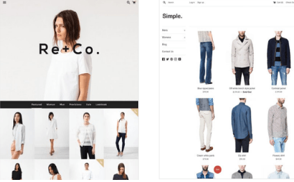
You may not be able to totally avoid making mistakes in your web design, but there are some mistakes that could be elements of suicide to your website. One general rule is that simpler is better. Here are some web designing mistakes you need to avoid.

1. Not structuring your content so it is scannable:
Content is King, but if it is not attractive enough for your readers to dive in then it’s worth nothing. Your content should not be too much or too little. Who would really want to stop to read content that is presented in large blocks? Remember, this is the Internet and people like to be able to get things on the go and even use the net while doing something else. They will not spare the time to go through your block of content to get what they want. They will simply go where the content is more structured and easy to read.
Break up your content by using images, paragraphs, bullet points, numbered listing, headers and sub-headers. Well-structured content helps the reader to quickly scan through your content and filter it for the information he needs.
2. Unfriendly navigation that puzzles your visitors
Some web designers make the mistake of designing their website for themselves as opposed to for their visitors. You may be able to move around your site with ease, but your visitors can’t enjoy the same. If your navigation is puzzling to visitors you will lose them. They cannot read your mind and will not spare the time trying to do so when there are other sites they can go to. Lose the endless links and ensure your design is user-friendly. Your navigation should be laid out in such a manner that your the visitor knows with a glance where the home page is, where he is, where a certain click will take him, and how to return to the previous page.
3. Using fancy fonts that are not readable
The fancy fonts you use should add to the aesthetics of your website, but they should also be readable. You want your visitors to be able to read and understand what you have to say, so ensure you use fonts that will facilitate your intentions.
4. Opening new browser windows
This is generally used as a means of trying to control the visitor’s actions so that they do not leave the site. It is a common mistake that many web designers make. The visitor must be given the choice of staying on your website or going on to visit another site from your links. Once your website is good you do not have to worry. Browsers are equipped with a back button, so once your site is good the visitor will be back. Simply allow them to decide whether or not they want to open the link in a new window.
5. Resizing the user’s browser windows
This is a total no no. Aside from the fact that ethically, the user should be the one to control his browser, resizing can mess things up for them. This can lead to an instant rejection of your website, and create credibility issues. People prefer when they are able to adjust a site to suit their taste. Allow them.

This is Rohan, I’m a Digital marketing Expert, Full time Content Writer and founder of BoxerTechnology.com I can help people across the world through my articles. I am sharing the latest stories from companies like Apple, Samsung, Google, and Amazon.


Leave a Reply