Yesterday night, I made a painting. And I had lots of fun with brushes and paints. There is nothing fancy about that painting. But you know what? I moved my hands to its best, to make the painting amazing.
I chose well combinations of colors, cool brushes, quality painting papers, and set the whole painting environment with my own hands – and lots of other important things. I know I’m not a professional painter, but I tried my best to make my painting best.
Why go to all the trouble? Because good colors what makes painting attractive, not the concept.
My friend (Who is somewhat good at painting) taught me that. Every time he picks up his brush to paint anything, he obsesses over how final painting looks before it makes into museum.
He knew very well that colors is what that makes painting good not the concept. So color comes first, concept second.
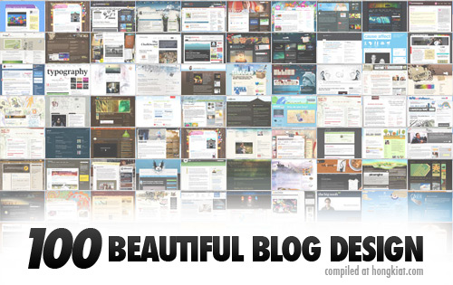
The same goes for writing. “Your blog design comes first then content.”
First Impression Is Last Impression
Before your viewers understand your concept or story of your painting, they are going to feel your painting with their eyes. If your color combination and everything else in inevitable then, they will think about what message your painting gives. If not then everything ends there.
So a single glimpse of your painting will decide that your painting is going to make it into museum or dustbin.
Same for our writing.
Before your readers read your actual words, they are going to look at:
– How good your blog layout is
– How good your blog Typography is
– How good your blog looks
– How long your content is
– What type of image you’ve sticked
– Is your blog distraction free? And lots of other things.
Everything around your words plays an important role to entice your readers to read your content. There is an old saying that “Medium Is the Message.” If you follow it, you will be on new heights. If not, then you will make a big mistake.
A Big Secret Of Painter
“What you paint is not matter that much – then how you paint it.”
We write long content copies, when the same message can be pronounced in one or two paragraph. We get satisfied with creepy looking design, because we want to save our wallet. And we sacrifice a great message because of a bad package.
It’s really not good, for saving some bucks we lose million dollars.
Remember one thing in writing, how you write matters most than what you write. If surrounding of your content is not good, then no one likes to read what you’ve written.
“Its presentation that makes everything attractive and engaging.” – So try to present your content as attractive as possible. Best examples are Copyblogger and Problogger.
Excellent Delivery
Every painter thinks one a million times that this is the best that I can do. If answer is yes! Then they make painting live.
Same for us. Lose some money out from your wallet to create a quality platform. Then write your message in a way that actually gets read. And please pay your full focus on the presentation.
I’m sure that it will make a big difference.
My final words
For me “What makes painting good?” is its simplicity, something that you can’t take your eyes off. My opinion is same for blog designs. I like simple blog designs, focused on make content look good like copyblogger, Problogger, blogussion etc…
What’s your opinion about blog design, which gets us reader?

This is Rohan, I’m a Digital marketing Expert, Full time Content Writer and founder of BoxerTechnology.com I can help people across the world through my articles. I am sharing the latest stories from companies like Apple, Samsung, Google, and Amazon.


Leave a Reply